GroIMP's File Explorer shows all those files of the project which have an immediate meaning as files to GroIMP. These are source code files, plain text files, HTML files and the like. Files which are used to define non-file-like objects (e.g., images, 3D geometry, data sets) are not shown in the file explorer panel, they are accessible in the panels of the corresponding object type.
If the file explorer is not already shown, open the panel via the Panel menu. As you will know it from your system's file browser, GroIMP's file exporer displays files in a tree-like structure. Files may be activated by a double-click or pressing the Enter key: On activation, source code and text files are opened in the text editor, HTML files are shown in GroIMP's integrated browser. At the moment, files cannot be renamed, moved or deleted in the file explorer.
Files which already exist in your file system can be added to a project via the menu item Object/New/Add File. You have the choice to link or add these files: A linked file does not become part of the project, the project just references it in your file systems. Changes to a linked file take effect on the project when GroIMP (re-)opens the file. In contrast to a linked file, an added file is copied into the project, thus, after addition, there is no connection between the original file and the project any more.
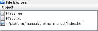
In File Explorer, a file explorer panel is shown.
FTree.rgg is a source code file,
FTree.txt a text file which contains some
explanations about the project FTree, and
index.html is a link (indicated by the
small arrow at the lower left corner of the icon) to an HTML
file.
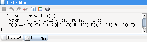
GroIMP is equipped with a simple internal text editor. When you activate a source code or text file entry in the file explorer, it is opened in the text editor and can be edited. The usual editing operations (Cut&Paste, Undo/Redo, Save) are available. Text Editor f-texteditor shows a screenshot.
For some file types, additional actions are triggered when a file of that type is saved. For example, source code is compiled immediately.
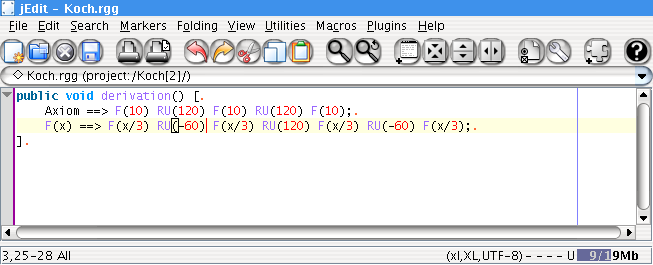
If the jEdit-Plugin is installed, the jEdit text editor is used instead of GroIMP's simple internal text editor. Text Editor jEdit shows a screenshot. jEdit supports syntax highlighting and contains various edit, search, and print commands. Comprehensive documentation is available via the Help-menu of jEdit.
Every image used within a GroIMP project, e.g., a colouring
texture of a 3D material, is shown in the Image Explorer. Its
structure is similar to the File Explorer. New images can be
added to a project via the menu Object/New: Currently, this
menu contains only the item From File which reads an existing
image file into the project. All file formats which are
supported by your installation of the Java Image I/O Framework
are readable, these are at least Portable Network Graphics
(png), JPEG and Graphics Interchange Format
(gif). If a format you need is not
supported by your installation, see
Installation of Plugins for the Java
Image I/O Framework. As for the File Explorer, you have
the choice to link or add image files to the project.
Another panel which you will encounter often is the attribute editor. It is used to edit attributes of a variety of objects: User settings of configuration objects, geometric attributes of scene objects, attributes of resource objects like 3D materials, and others.
Each attribute has a type, and each type brings up specific edit components in the attribute editor. For example, the radius attribute of circles or spheres is a numeric attribute and is editable through a simple input field. The orientation of a cylinder in 3D space is a 3D vector and, thus, it is editable through a set of three numeric input fields. Very complex attributes like 3D materials consist of several subattributes, each of which brings up its own edit components in the attribute editor.
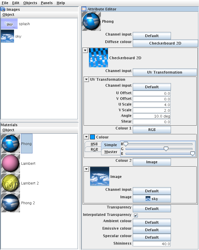
In Image Explorer, Material Explorer, Attribute Editor, you
can see the attribute editor for a 3D material of type Phong.
Such a material has the attributes Channel Input, Diffuse
Colour, Transparency, Interpolated Transparency, Ambient
Colour, Emissive Colour, Specular Colour and Shininess. The
Phong material shown has a Checkerboard 2D surface map as its
Diffuse Colour, the checkerboard itself has the attributes
Channel Input, Colour 1 and Colour 2. As Channel Input, an
UV-Transformation is chosen, its numeric attributes are
editable through the input fields. For angles and other
attributes which represent physical quantities, their units
are shown, in the this case deg which
stands for degrees. As Colour 1, an RGB colour is chosen,
whose values are modified by sliders.
Colour 2 of the checkerboard is set to an image map. One could have chosen an RGB colour as for the first colour, a Checkerboard 2D as for the diffuse colour of the material, a simple constant colour, or some other valid type for this attribute. In GroIMP, there are many attributes whose values may be of a set of different types. For all these attributes, a button is shown in the attribute editor which pops up a menu to choose the desired type. Once a type has been chosen, the attribute value is set to this type, and appropriate edit components are created. They are shown within a minimizable subpanel. To minimize it (and to maximize it later on), click on its upper border where a small button is displayed. For example, the subpanel for the RGB components of the Opacity attribute is minimized in Image Explorer, Material Explorer, Attribute Editor. A double-click on the upper border maximizes the subpanel and minimizes all other panels.
In GroIMP the preferences (from java preferences) are the software options. Most GroIMP options are managed by the Preference panel, which can be open from the menu at Panel>Preferences. By default, options are managed globally. i.e. when an option is set, every workbench will use it. There is an exception though. It is possible to setup an option file for a workbench, thus, using options defined in that file instead of the global ones.
Usually when a user change the options of GroIMP, he changes
the global options. These options are stored when set in the
java preferences (in
~/.java/.userPrefs/de/grogra/options/ +
path of the option). This enables the options to be
persistent between GroIMP uses. It also makes the options
persistent when an other version of GroIMP is installed.
Global options are used by every workbenches that do not include an option file.
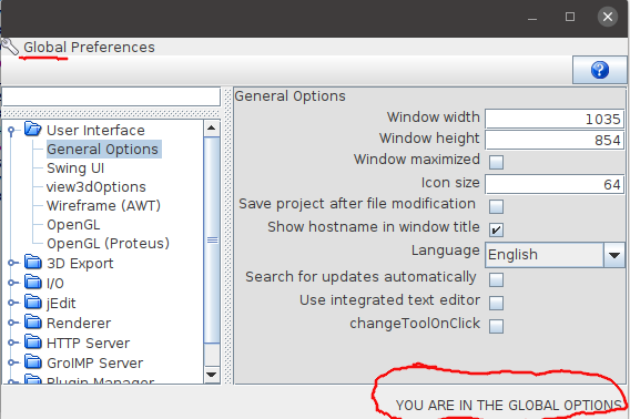
The panel of global options can be open if the currently
used workbench do not have an option file. In that case,
when the preference panel is open (with
Panel>Preferences) you can see the
Label on the bottom right that tells the current panel is
Global (see the red circle on the Image below).
GroIMP also support options specific for a given workbench (since version 2.1.4). The option file (called “workbench.options”) is shipped with the GroIMP project (at the root of the project.gs file, or in the .gsz archive). It enables to share a project with a specific set of options.
When the option file exists in a project, GroIMP will use its options instead of the global ones. If an option file contains more options than the current instance of GroIMP, these options are kept but not use. If the option miss some options that the current instance of GroIMP defined, these options are added to the option file when saved.
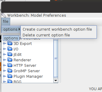
The option file can be added in a workbench from the
preference panel (Panel>Preferences). On the menu bar
file>options>Create current workbench option file.
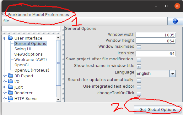
Once the option file is added, the view of the preference panel will change into the workbench option view In that view the name of the workbench whose options are managed is displayed in the red circle 1. On the bottom right a button to open the global options is available (see the red circle 2).
When a option file is created and added to the project it is automatically setup with all the existing current global options. When modifying workbench options, the options new value is directly updated, however the option file is not automatically updated. To push the modification to the option file the project needs to be saved.
To stop using the option file of a workbench, it can be
deleted from the menu option:
file>options>Delete current option
file.
The file can be modified outside of GroIMP as plain text. To add an option file in a project outside of GroIMP, the file needs to be added and the registry item OptionsSource needs to be added to the project.gs. Same when deleting the option file from outside of GroiMP: both the both the file and the registry item needs to be deleted. The MANIFEST.MF file must be updated as well.
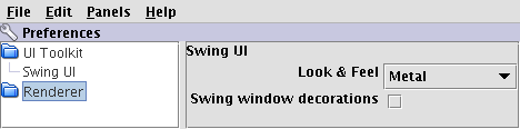
The group UI Toolkit/Swing UI in the Preferences panel lets you choose the Look & Feel of the Swing user interface and whether window decorations (title bar, borders, etc.) should be provided by Swing or by the native window manager of your system. The set of available Look & Feels depends on your Java and GroIMP installations: GroIMP's binary distribution is bundled with the Kunststoff, Liquid and Tonic Look & Feels.
If you switch to another Look & Feel in the Preferences panel, the user interface will be redrawn immediately. However, changing the window decorations option only takes effect when a new window is opened. Also, there are Look & Feels which do not support window decorations.
Besides files and images, a variety of other object kinds is displayed within an explorer panel. For example, Image Explorer, Material Explorer, Attribute Editor shows the Material Explorer panel. These panels are always similar to the file explorer or the image explorer: Objects are shown in a hierarchical tree-like layout, and new objects are created by the Object/New menu of the panel. The contents in this menu depend on the explorer: The Image Explorer reads in images from files, the Material Explorer allows the creation of new materials of several material types, etc.